Work

Climate Neighborhood Dashboard

Interactive dashboard exploring climate risks per neighborhood — heat, flooding, drought and green coverage across the Netherlands.

SvelteKitD3.jsMapLibreGIS
More info

How climate-proof is your neighborhood? This interactive dashboard for the Climate Effect Atlas gives quick insight into climate resilience at neighborhood level — from green coverage and heat stress to flooding risk. Compare neighborhoods by type or municipality, identify urgent challenges, and discover opportunities for climate adaptation. Built for municipalities and anyone working on climate-proof cities.

Visit project

Drought Visualization

Circular interactive visualization mapping the full drought chain — from meteorological causes to impacts on water, soil and economic sectors.

D3.jsReactBézier curves
More info

An interactive circular visualization that maps the full drought chain in the Netherlands — from meteorological causes to impacts on water systems, soil, and economic sectors. Users explore cause-and-effect relationships by hovering and clicking through interconnected layers. Filter by landscape type or stakeholder to find relevant drought impacts and adaptation solutions. Developed for the Dutch Ministry of Infrastructure with data from Deltares research.

Visit project

Pontkomt

Realtime ferry app for Amsterdam. Built as web and native app with SvelteKit and Capacitor, using GTFS and OVapi public transport data.

SvelteKitCapacitorREST APIiOS/Android
More info

When does the next ferry leave? Pontkomt answers that question in real time. Built as both a web app and native iOS/Android app, it parses GTFS-realtime and OVapi public transport feeds and presents departure times in a clean, glanceable interface. A personal project born from daily ferry commuting in Amsterdam.

Visit project

Unseen Heat

Award-winning interactive visual story exploring extreme heat scenarios in the Netherlands through 2050, with data visualizations and audio narration.

SvelteKitD3.jsScrollytellingAudio
More info

What if extreme heat becomes the new normal? Unseen Heat is an interactive visual story exploring potential heat scenarios in the Netherlands through 2050. Combining data visualizations with audio narration, it turns scientific climate projections into an immersive scrollytelling experience — making temperature data and return period statistics tangible. The project received an award at The Climate Creatives Challenge by The Environmental Design Studio, and was published at the EGU General Assembly 2024.

Visit project

CV

Experience

2019 — present
Lead Data Visualization Designer

Climate Adaptation Services

2018 — 2019
AI Intern — Real Estate Fraud Detection

City of Amsterdam & University of Amsterdam

Awards & Publications

2024
Climate Creatives Challenge

Award — The Environmental Design Studio, for Unseen Heat

2024
EGU General Assembly

Publication — "Unseen Heat: a visual climate story"

Skills

SvelteKitReactD3.jsNode.js PythonPostgreSQLSupabase GIS / GeospatialMapLibre Dashboard & UX designCartographyData storytellingIllustrator REST APIsGit/GitHubCI/CD

Education

2016 — 2019
MSc Artificial Intelligence

University of Amsterdam

2011 — 2016
BSc Natural & Social Sciences

University of Amsterdam — Major in AI

+ Minor Physics · Minor Programming

Hobbies

Drawing Music
Bouldering
Basket weaving
Gardening
Football

About

About me

I make data visible in forms that go beyond standard charts — from interactive maps and dashboards to infographics and data-art.

You have to dare to go further than your own imagination. A good visualization not only provides insight into the data, but also resonates visually and fits the subject and audience.

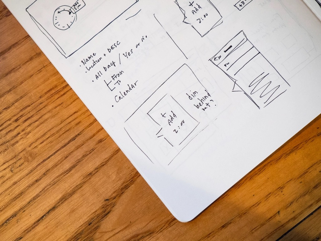
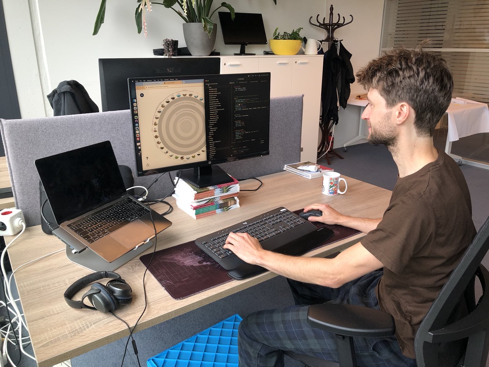
I mostly work with climate data and geo-information. From brainstorm and sketch to code and delivery — I'm involved in the entire process. I design thematically appropriate visualizations where the form matches the content, like a burning tree for forest fires or a blood stain for war casualties.

I also teach data visualization and mentor students in visual data communication.

Outside of work, I draw portraits, play music with my band Steelstreet, go bouldering, weave baskets, and tend to the garden.

Contact

Interested in a collaboration or have a question?

Send an email
scroll to explore
scroll to explore

Daniel Data Design — Daniël Staal, Data Visualization Designer

I create interactive data visualizations, maps, dashboards, data-art and infographics. Specialized in climate data and geo-information.

Work

Climate Neighborhood Dashboard — Interactive climate risk explorer for the Climate Effect Atlas.

Drought Visualization — Data storytelling about the drought chain in the Netherlands.

Pontkomt — Realtime ferry departure app built with SvelteKit and Capacitor.

Unseen Heat — Interactive climate storytelling about extreme heat scenarios.

Experience

Data Visualization Designer at Climate Adaptation Services (2019–present). MSc Artificial Intelligence, University of Amsterdam.

Contact

Email: dmgstaal@gmail.com